
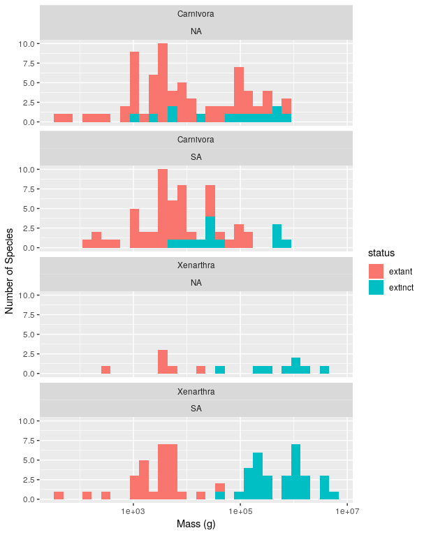
There were a relatively large number of extinctions of mammalian species roughly 10,000 years ago. To help understand why these extinctions happened scientists are interested in understanding if there were differences in the size of the species that went extinct and those that did not. You are going to reproduce the three main figures from one of the major papers on this topic Lyons et al. 2004.
You will do this using a large dataset of mammalian body sizes that has data on the mass of recently extinct mammals as well as extant mammals (i.e., those that are still alive today). Take a look at the metadata to understand the structure of the data.
extant and extinct in the status
column). There should be one sub-plot for each continent and that sub-plot
should show the histograms for both groups. Don’t include islands (Insular
and Oceanic in the `continent column) and only include continents with
species that went extinct in the pleistocene. Scale the x-axis
logarithmically and stack the sub-plots vertically like in the original paper
(but don’t worry about the order of the subplots being the same). Use good
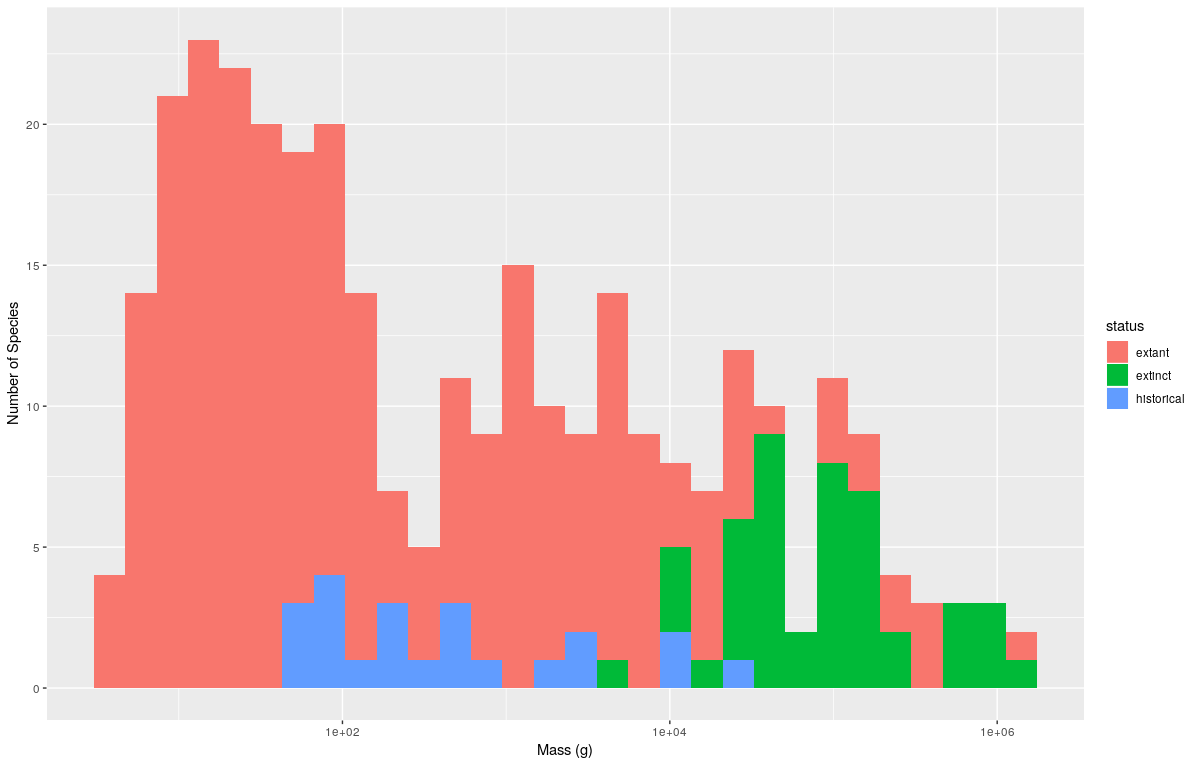
axis labels.extinct in the status column) and more modern extinctions
occuring over the last 300 years (historical in the status column). Make
a plot similar to the previous plots that compares these three different
categories extinct, extant, and historical). Has the size pattern in
exinctions changed for more modern extinctions?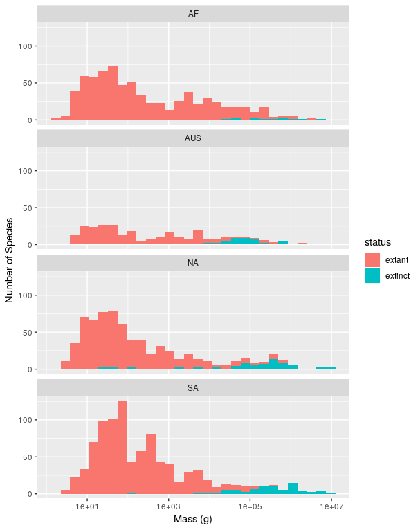