
An experiment in Kenya has been exploring the influence of large herbivores on plants.
Download the data on Trees for the
experiment
into a data subdirectory. There are a number of problematic entries in this data so use the readr package to import it:
library(readr)
trees <- read_tsv("data/TREE_SURVEYS.txt")
trees data frame named canopy_area that contains
the estimated canopy area calculated as the value in the AXIS_1 column
times the value in the AXIS_2 column. Print out the SURVEY, YEAR,
SITE, and canopy_area columns from data frame.canopy_area on the x axis and HEIGHT on the y
axis. Color the points by TREATMENT and plot the points for each value in
the SPECIES column in a separate subplot. Label the x axis “Canopy Area
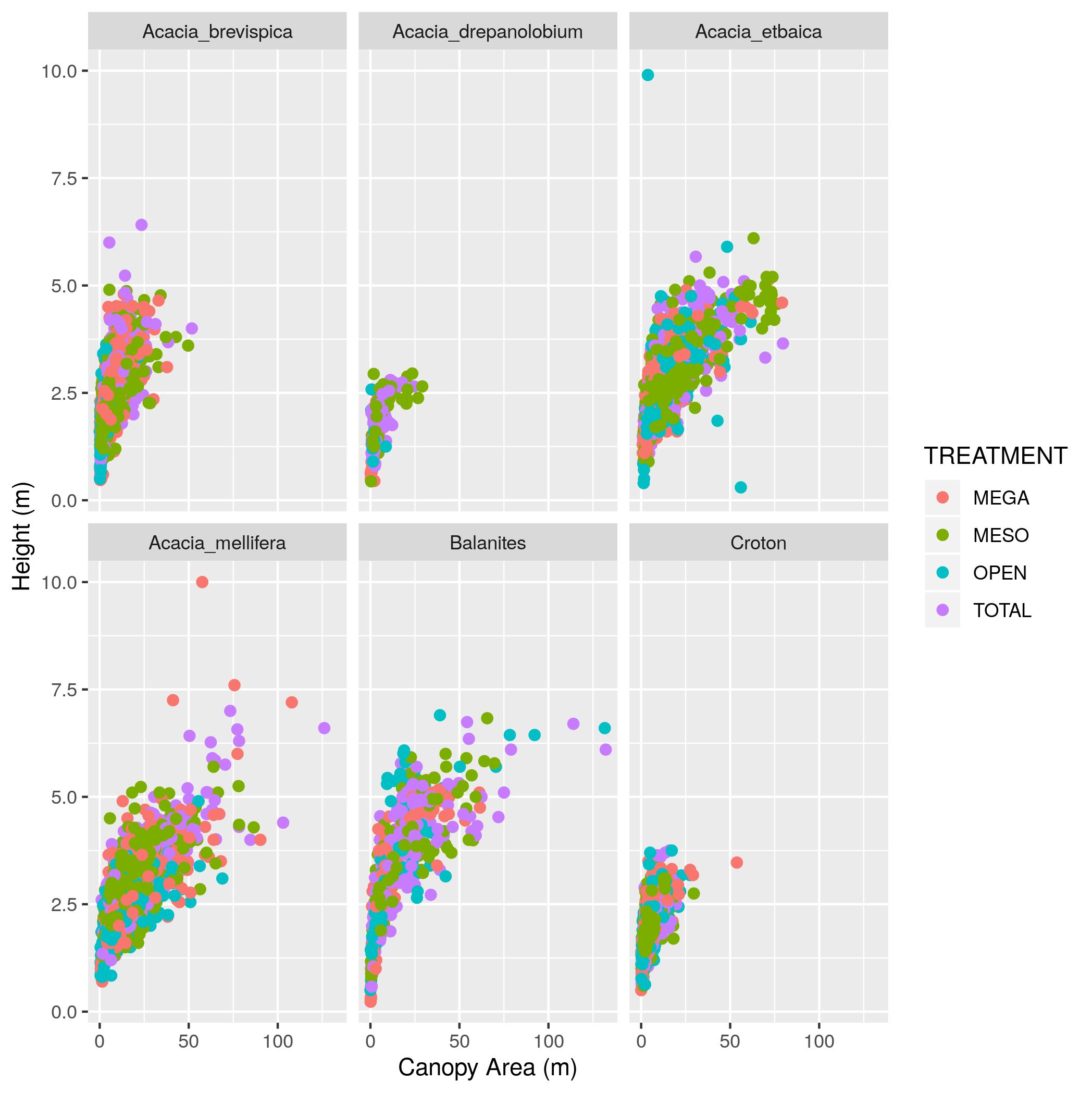
(m)” and the y axis “Height (m)”. Make the point size 2.AXIS_1
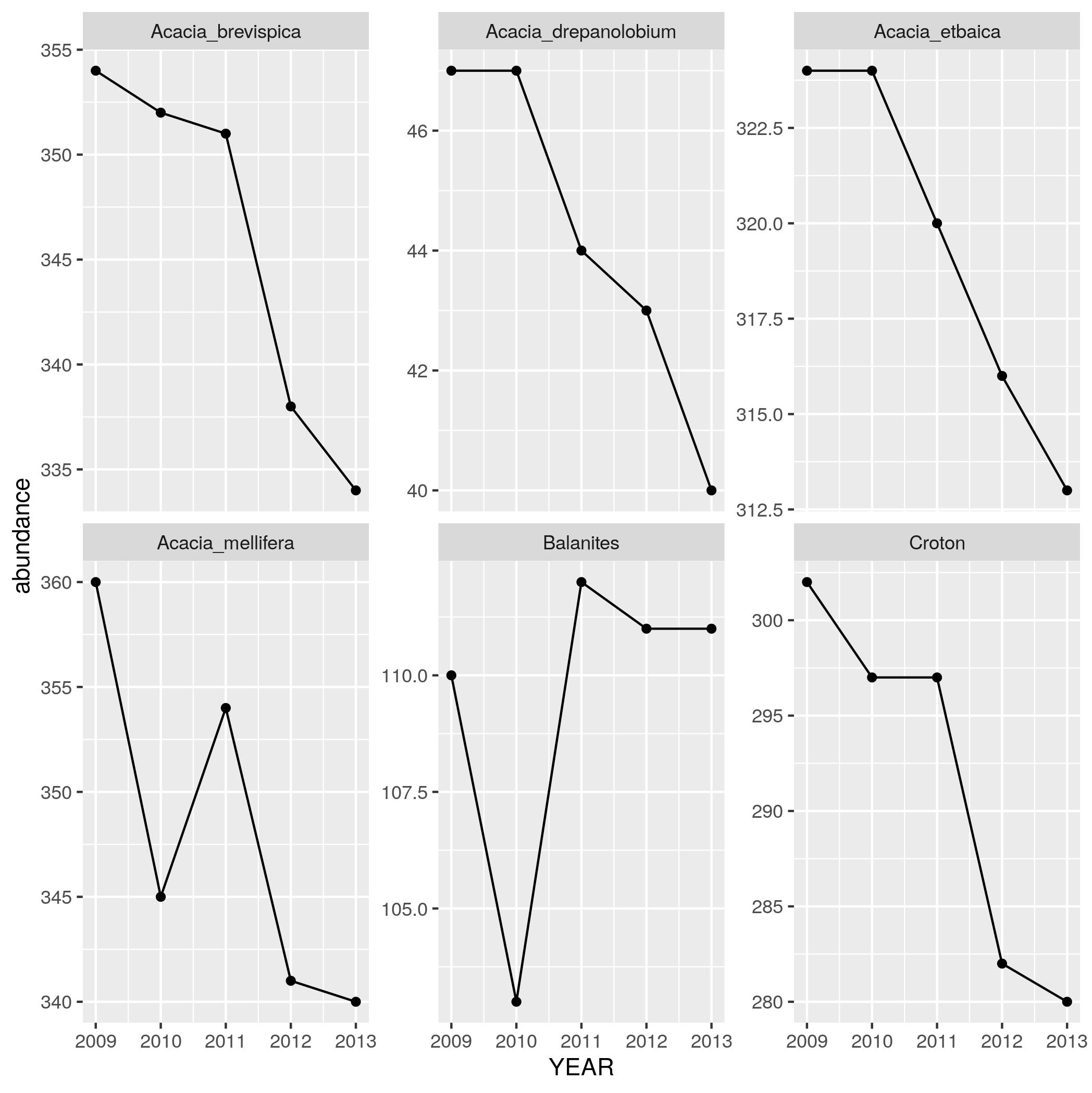
and AXIS_2 that are over 20 and update the data frame. Then remake the graph.group_by, summarize, and n to make a data frame with YEAR,
SPECIES, and an abundance column that has the number of individuals in
each species in each year. Print out this data frame.geom_line in addition to
geom_point) with YEAR on the x axis and abundance on the y axis with
one subplot per species. To let you seen each trend clearly let the scale for
the y axis vary among plots by adding scales = "free_y" as an optional argument to facet_wrap.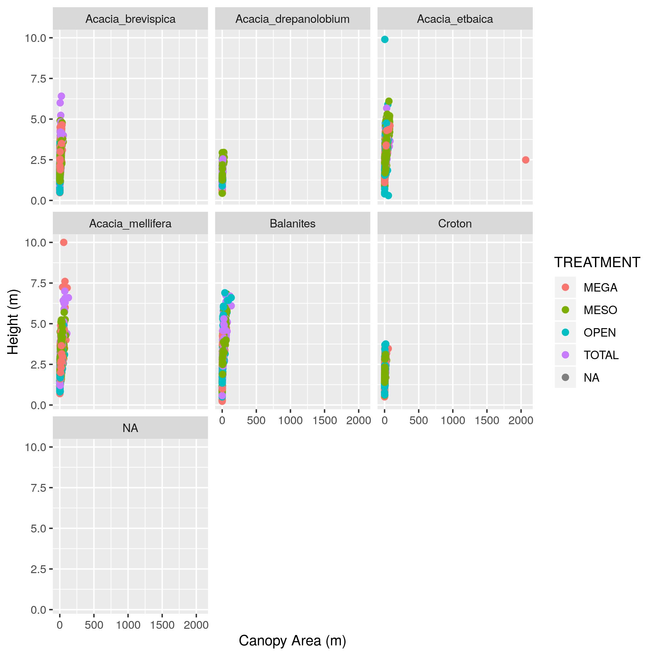